in class presentation on the wall
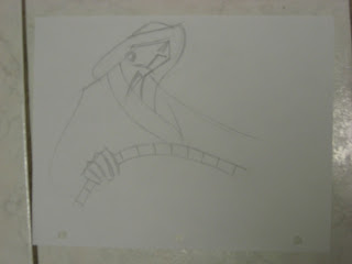
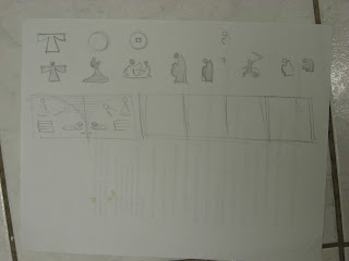
more sketches on layout, this time moving down to the aesthetic of the clothing
Here focusing on my topic, which is the final chapter of the book "memory". I will quickly discuss that in my later moodboads.
For my illustrations for the bookllet, I tried to stylized the figures for the audience that I am intending towards, which is mainly the late 80s and the 90s, people during this age are morely tuned into something that is much more easily undestande, so visuals are the key aspects. I try to condense the characters down as simplifed as possible to its essential nature or feautures. As long as people get that touch of the fluid, layering, and loose feel, then I guess I have met my goal.
simply figure logos for the chapter heads


No comments:
Post a Comment